How many forms can one logo have? Some people would say “of course one”. But Fluid identity which is becoming popular these days will tell you no. fluid identity means logo systems that use multiple iterations of a mark (or series of marks) to communicate a particular aspect of a brand. These might take the form of a logo that changes with each viewing, or a singular mark that gets impregnated with different imagery, depending on the context. Moreover, new technology has applied in some fluid identity, which makes dynamic logos. The logos which animate from different colours, shapes and so on are put on the websites or other non-print media. Although the days of the static logo are certainly not extinct, this persistent way of thinking about malleable identities seems like a portend of things to come.
So I got some questions for this new type of visual identity and through examples to consider these questions.
1. what kind of company fluid identity should be considered
2. how to communicate a clearly company image through multiple expressive forms
3. how to interact with the audience using fluid identity
4. how to make the single pieces equal the whole identity
5. what kind of information the company want to communicate through fluid identity
1. Nordkyn
Great looking identity for Nordkyn, in northern Norway by Neue. Nordkyn is a peninsular dominated by the arctic weather, and this amorphous logo reflects that. The prism logo is animated to move in the direction of the winds, and changes colour with the temperature from -25ºC to 25ºC. It is a very simple concept that is executed beautifully.The idea came from a stylised snow flake, which represents the calm state (look at bottom left). The wind then blows this prism in the different directions.The logo then changes colour based ontemperatureExamples of the logo in different states of wind and temperature.
2.MIT media lab
The basic idea here is that the logo has three intersecting spotlights that can be organized in any of 40,000 shapes and 12 color combinations using a custom algorithm. That’s enough to supply each and every new card-carrying Media Labber with his very own logo for a whopping 25 years. Folks select a design on a web-based platform, and once they’ve made their choice, no one else can poach it; it’s as personal as a Social Security number.
3.AOL
People use AOL ostensibly as a search engine, to find all sorts of things, so this identity leverages that multiplicity with a wide variety of supporting images. Although the AOL logo itself will be constant, the backgrounds will change continuously in an effort to suggest the breadth of AOL’s content. Hundreds of backgrounds are ready to go, among them depictions of a fish, a skateboarder, a View-Master, a leaf, a lovable monster, a Polaroid camera, a high-heel shoe, a head-banging rocker and a kissing couple.4. Casa da Música
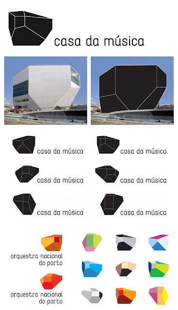
This identity is based upon the shape of the Casa da Música in Portugal, the building designed by Rem Koolhaas.They created Casa da Musica logo generator. Based on content's color (e.g. a poster) the generator "calculates" the logos colors.
Reference:
The analysis paradigms of fluid logo
1. Colour
2. Symbol
3. Font
4. Except these elements that normal logo has, the most obvious feature of fluid logo is multiple variations of the form of logo.
From the examples, I can conclude that
1. All the fluid logos are all based on a big frame, and through the variation of colours, positions, shapes, and images to create an individual identity. So this is how the single pieces equal the whole identity.
2. Some logos are created to communicate the variety products or service
that the companies’ offer or the features of brand.
Ex: In the case of Nordkyn, with its arctic and rapidly-changing weather conditions, this is a distinctive and smart logo that connects the logo with Nordkyn which as a brand very well. The tagline – “Where Nature Rules” – is reflected directly in the execution of the logo and also expresses the main feature of the Nordkyn which is beautiful natural scene.
In the case of AOL, logos changing from variety supporting images to communicate that the company is a premier and pioneering Internet service provider.
In the case of MIT media lab, the logo’s varying nature what MIT media lab does.
3. Some fluid identity can interact with audience, which maybe is the trend for future branding development.
4. The fluid identity is more flexible to work on various freeing ways because its features.
5. New technology is applied in some fluid identity, which makes dynamic logos.
These kinds of logos help company to stand out, and it challenges the way we thinking of the branding. More important, it makes the brand have a certain emotional relationship with their audience, which is a trend for future branding. But for me, there alsois a question existing,
One of the criteria of a good logo is versatile, so I think some fluid logos cannot achieve this criteria, such as AOL logo, the logos are changing form different supporting images, I think it will not work very well when the logo is small.


没有评论:
发表评论